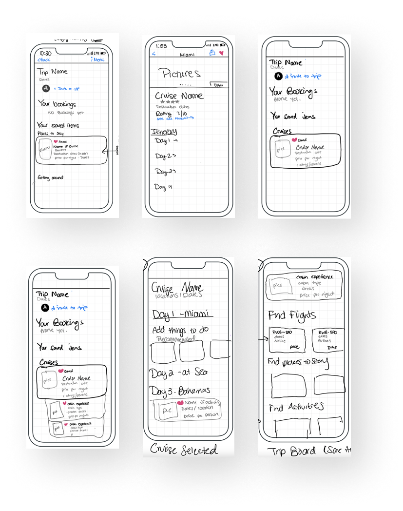
Expedia Mobile App
Optimizing Expedia’s cruise booking for a streamlined and enhanced user experience

Project Overview

Improve the cruise planning experience to increase customer base and satisfaction

My Role:  UX Designer

Key Principles: Double Diamond, Jobs to be Done (JTBD) Framework, Design Identity, HMW Framework.

Process

Immerse
Analyzed existing research, conducted competitive analysis, and uncovered pain points
Frame
Formulated HME statement to guide ideation
Ideate
Brainstormed and designed iterations of new feature ideas
Execute
Designed high-fidelity mockups and interactive prototype

Background
Research

To uncover the core user pain points and frustrations I analyzed the previous research studies. I also spoke to the designers and researchers working in the cruise product area. Based on the existing research, I found two main recurring pain points.

1. Users have trouble remembering cruise details

2. Users get confused because trips are not centralized 

Competitive
Analysis

I analyzed competitor cruise companies websites based on 4 main features. I discovered for Expedia to be on par with its competitors it needs to have:

1. An Itinerary Builder
2. Provide details on destinations and things to do
3. Provide more details about cabins

Expedia's cruise flow lacks features in planning & organization

How might we encourage users to narrow down their options by saving items so they can complete their booking efficiently?

Ideation -
Sketching

As part of my ideation process I explored how a cruise and cabin should look when saved and what information to include. I also brainstormed and sketched 2 designs of an itinerary builder feature.

Ideation 1 - Saving Cruises

Iteration 1 was my starting point. In this iteration, I explored a nested card design, where the saved cabins for a cruise would appear below the overall cruise details. However, I noticed a few issues with this particular nested design. One was that the images were hard to see. It would be difficult for the user to see the differences between different types of cabins. Another issue was that in this nested design, the saved cabins appear to be separate from the cruise.

How can IA help users find info they need?

Ideation 2 - Saving Cruises

In the 2nd iteration, I changed my design to solve the previous issues. For example, I made the images wider so it was easier to see. I also created a more nested feel to the design by reducing spacing for the saved cabin details. This makes it more compact, communicating the connectedness between the cruises and the saved cabin. However, while creating a more nested design solved one issue, it also created another. The compact nature of the design causes information overload.

How to show the relationship between cards?

Ideation 3 - Saving Cruises

To remediate this issue, in the 3rd iteration, I explored an accordion design pattern. When a user clicks the arrow next to a cabin type, it would expand and provide more details. I chose an accordion design because it would give users details on-demand, without taking up too much screen space. In this version, there is more information provided about the cabin.


I used Expedia's design system and components to create the card designs. While creating the iterations, I made sure I did not deviate from the original card design too much. I wanted my designs to be consistent with the ones already created. The consistency will make it easier for users to understand the design because it will be familiar to them.

Why is this design sucessful?

Ideation 1 -
Itinerary Builder

I envisioned a solution to the problem of scattered trip details: an itinerary builder. My 1st iteration leveraged the existing cruise itinerary format, placing booked items under the corresponding days and cities, such as the water taxi tour in Fort Lauderdale. I even added a recommendations carousel for extra suggestions. However, the design lacked visual appeal, and competitors offer more customization options. It was clear that users needed greater control over their itineraries.

How to leverage the existing cruise format?

Ideation 2 & 3-
Itinerary Builder

In my 2nd iteration, I added a search for flights and hotels, knowing that many cruise travelers book accommodations for the night before their departure. This was especially helpful for first-timers or infrequent cruisers who might overlook this crucial step.


Building on this, I created a 3rd iteration that transformed the flight/hotel search into recommendations. I also introduced a "Day 0" to encompass travel arrangements before the cruise officially began.

A better design - searches to reccomendations

Ideation 4 -
Itinerary Builder

To give users a clearer picture of their cruise adventure, I designed a timeline view for the itinerary. Each day of the cruise was laid out chronologically, like a roadmap to their vacation. After booking a cruise, users could toggle between their saved and booked items and the itinerary builder. This powerful tool allow them to customize each day of the predetermined cruise route, adding activities in or around the city.


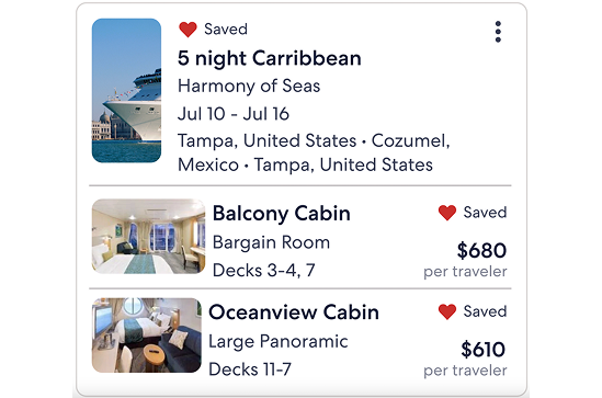
By centralizing all their trip details—flights, hotels, cruise, and activities—the itinerary builder solved a major pain point for users. It seamlessly incorporated booking information, like hotel check-out times, port departure times, and displayed activities in chronological order on the timeline.

Visualizing the journey - a customizable itinerary too

Next Step -
Usability Testing

To ensure my design was user-friendly, I planned to conduct usability testing. Unfortunately, due to project timelines, I couldn't carry out actual testing. However, I developed a comprehensive research plan with specific goals: assessing the ease of saving cruises, evaluating the itinerary builder's user-friendliness, identifying any usability obstacles, and gathering valuable user feedback.


I envisioned a moderated remote testing approach, collecting metrics like success rates, task completion times, and user satisfaction through questionnaires and interviews. I even created two testing scenarios to simulate real-world usage.